November 10, 2010

Firenze, Italia

Firenze, Italia .. what a beautiful life to live. I am nearing the end to an unforgettable semester abroad. Memories to last a lifetime. So far, I have traveled to Siena, Roma, Lucca, Cinque Terre, Parma, Modena, Bologna, Torino, Fiesole, and Venice. I also had the amazing opportunity to travel to Munich for the 200th anniversary of Oktoberfest! I have fallen in love with Italian culture and way of life; the real culture shock will be going back home in the states. Oh Massachusetts, although I do miss you, I wish I could spend more time in Italy.


A typical day: a twenty-five minute walk to school which starts off with a cappuccino from our favorite cafe a few blocks from our flat. Did I mention I must walk past the magnificent Duomo of Santa Maria del Fiore everyday? Gazing upon Brunelleschi's masterpiece reminds me why I came to study in Firenze and why my heart belongs to design. After classes I typically stroll home for a quick lunch of some fresh baked bread with some meats and cheeses, all from the fresh market five minutes from our flat. The afternoon is mine, if I am not working on schoolwork I can indulge in whatever I please. The best, walking. Walking wherever I wish to go I stumble on new places and admire those I already know so well. Dinner is my favorite time of the day. Cooking is another one of my passions and I absolutely love making elaborate dishes for all six of us lovely girls. Access to the best ingredients is incredibly easy. The food in Italy is AMAZING! My personal favorite, parmigiano-reggiano right from Parma. Another Italian specialty is their balsamic vinegar. On a trip to Modena I had the pleasure of tasting twelve and twenty-five year old balsamic and yes, it was like heaven in my mouth. Really.

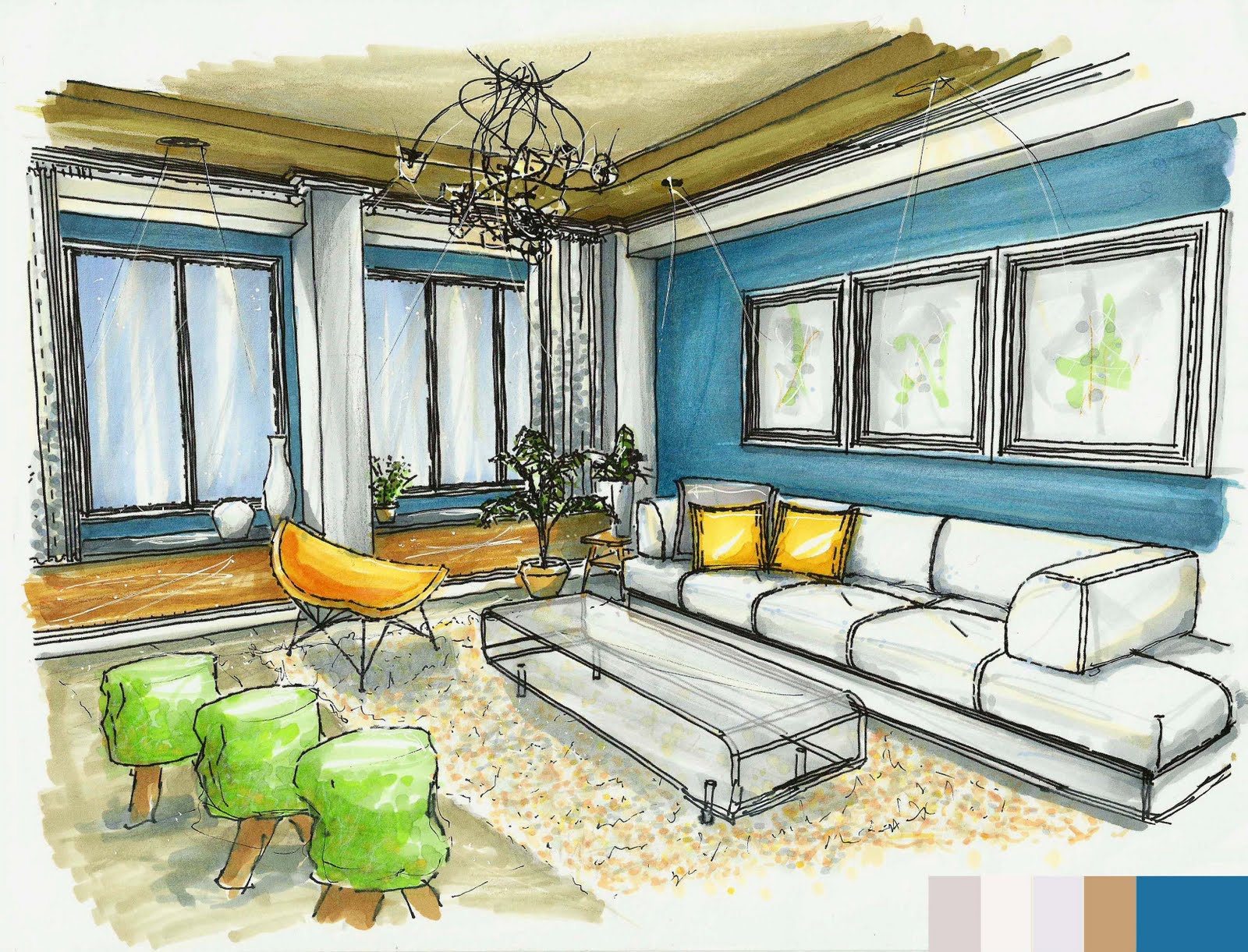
I couldn't ask for more when it comes to my classes. All of my professors are top notch designers in their field. I feel as though I have learned so much so far this semester. In my lighting design class I created a custom light fixture using Cinema 4D. In my 3D Computer design class my professor rocked my socks off by telling us about all the awesome new computer programs we were going to learn. I got to learn how to use MeshLab, Cinema 4D and Rhino is on the way. In my studio class I got to design a Tuscan barn into a modern home for a family of four. For my final project I am working in a group with my close friend, Andrea. Retail design here I come and we decided were going to design a fair trade store which sells coffee, trinkets, and flowers! Speaking of final projects, it is very sad to think about the fact that I will be leaving this wonderful country in a few short weeks.

I will be posting more from my time here in Italia; some projects along with some case studies of retail stores targeted for their lighting design. It should be molto interessante!

Ciao! -av

Dodo Boutique


Dodo Boutique
Via de' Tornabuoni 39/41r Firenze, Italia

Dodo Boutique is a small specialty jewelry store in the heart of the shopping district in Florence. Their clientele consists of dedicated jewelry lovers who keep coming back for more of Dodo’s spectacular gems. If customers are not coming back for the jewelry, it is because they want to spend time inside the beautiful boutique designed by Paola Navone.

The design in Dodo Boutique is based around the concept of the extinct bird the dodo. This fairytale-like shop is complete with eccentric colors, organic shapes, and fantastic lighting. The experience begins from the street; people gazing into the store windows with curiosity, wondering whether or not they should enter. If you are brave enough to go in, you must first tackle the substantial front door that takes your from the busy streets of Florence into the mystical world of the dodo. The amazing design of Dodo has a great deal to do with the lighting. Large awnings hang over the dark glass front windows; the store depends greatly on the use of luminaries. The lack of daylight with the use of luminaries sets the mood for Dodo. From the aluminum tile floors to the green tube ceiling, the lighting in Dodo exemplifies the products perfectly, and completes the design throughout.

The general lighting of the boutique is carried out by directional luminaries with parabolic reflectors. A sea of green tubes suspend vertically from the ceiling, encompassing the luminaries so that they are hidden. The placement and quantity of luminaries is perfect, no space in the boutique is over or under lit. Blotches of light hit the aluminum tile floor and dissipate, illuminating the whole boutique and its products. Above, patches of the ceiling glow where a luminary exists; this exemplifies the extremely unique ceiling. Luminaries towards the walls direct down on them, acting as wall washers. They run up and down the whole store, showcasing the unique walls which look as if a person was drawing designs in wet sand.

Smaller circular luminaries are used throughout the boutique for lighting display cases. For the display cases in the wall, luminaries are fixed above the jewelry, hidden by green tubes. Jewelry rests atop green display fixtures; the light balances this with the green tubes above making the display case very appealing to the eye. Another display case rests on a table; customers look down at the products opposed to at eye level. This case is illuminated by round luminaries that are housed in a bronze pedestal. The bronze fixture is curved downwards onto the jewelry. This lighting technique is perfect; the fixtures blend great with the jewelry and come across as a piece of art.

If you look down, circular blue luminaries will catch your eye and drag you down a hallway of wonder. These luminaries are flush with the floor and are placed in juxtaposition from the end of the hallway to almost the front of the store. The floor luminaries travel down the center of the hallway, illuminating a blue path. At the end of the hallway there is a vertical blue fluorescent tube fixed to the wall which illuminates the area surrounding in a bright blue. The ceiling in the hallway is arched; at the point where the wall joins the ceiling there is recessed horizontal blue fluorescent tubes. This indirect lighting washes the ceiling and renders it blue. The hallways is like the front windows of the boutique, you look inside in amazement, wondering what is in it and if you should enter.

My overall opinion of the design of Dodo is that it is a spectacular work of art. The design showcases the products in such a way that it is an experience to buy jewelry from Dodo. Not overwhelming, the finishes and materials made the store fun and friendly while also conveying impressive elegance. The placement of the luminaries in the ceiling was superb; the array of luminaries made the floor and ceiling look alive and you felt as if you were really inside a dodo habitat. The lack of daylight and the privacy of the dark windows also followed through with making the boutique feel like a different world. Experiencing life on the wild side while shopping for jewelry, what a concept.

April 25, 2010

Benjamin Moore Envision Color Student Design Contest - Vote for my friend please!!


Benjamin Moore 2010 Envision Collor Student Design Contest
Entry: Allyson Nicole Fairweather, Endicott College
http://www.envisioncolorcontest.com/gallery/entry/508

One of my very close friends, Allyson Fairweather, has recently entered a competition put on by Benjamin Moore. The competition is the 2010 Envision Color Student Design Contest and is intended to showcase the Benjamin Moore Envision color palette.

Students had the choice of space and could focus on any aspect of the room they desired. In my opinnion, I especially like Allyson's selections for this competition. First, the fact that she hand rendered the perspectives and floor plan gives the spaces more depth and reality. Second, I love that she decided upon using a residential space. Her drawings allow for the common home owner to look upon and gain inspiration. Lastly, I appreciate the wide array of colors used, and that she showed the same space with different color palettes.

If you enjoy these drawings as much as I do please go to this link and vote for my friend Allyson. It is so simple! Enjoy!


ENVISION VERSATILITY
"The Envision palette is full of bold colors that combine beautifully in countless ways. The Den was originally designed using Claret Rose to render a rich, warm room for lounging. But why commit to one color scheme when there are so many other fashionable combinations in the Envision color palette? A second scheme with Blueberry illustrates a relaxing studio atmosphere whereas a third scheme with Cedar Green and August Morning embodies a refreshing sensation. The primary colors were chosen to exemplify the remarkable ability of the Envision color palette and the flexibility of the Den design."


April 12, 2010

Ad Council Boston

Ad Council Boston
by Amanda Veliotis
Submitted on 07 April 2010

Fall semester 2010 I got the pleasure of experiencing office design in our Office Design Studio. For our first project, we were assigned to chose a non profit organization for which we would be designing their new office space located on the lovely Newbury St. in Boston. Other than designing for the greatest employee productivity, we also had to strive for the greatest indoor air quality. Every material and finish in the design is sustainable; releases no harmful toxins, is made of recycled materials, and is 100% recyclable. Enjoy! -av


Street Level Floor Plan
From left to right; entrance, vestibule, reception, elevator, hallway (display & library) to volunteer workstations, long term filing, small conference.

Lower Level Floor Plan
From left to right; large conference, storage, elevator, lounge, kitchen and break room, staff offices, assistant directors office, directors office, recycling.


Street Level

Building front facade


Reception desk and large accent wall behind. Accent wall made of Modular Arts in beadz (center) with 3form chroma (atlantic) in front of it with panels of 3form chroma (vitamin c) to the sides. The flooring throughout the office is Flotex Montana (ocean) by Forbo. All the paint throughout the office is Pro Industrial 0 VOC Acrylic Semi-Gloss paint from Sherwin Williams.


Volunteer workstations looking towards the hallway leading to the small conference room. Tables are made of recycled material and are from Ecowork. The chairs are from Herman Miller (eames molded plastic chair). The separation wall is made of 3form chroma (vitamin c) and separates the volunteer room from the hallway which houses the library and display wall.


Volunteer workstations looking towards the reception. the ceiling is a custom piece that is personally my favorite. Following my concept of puzzles, I created a cross word puzzle on a drop down soffit on the ceiling. All the ceiling throughout the office space are sheetrock gypsum panels on a drywall suspension system by USG. In the hallway to the right is a custom library shelving unit made of 3form chroma (atlantic) and a display wall made of 3form chroma (lawn).


Lower Level
This is a view of the hallway looking towards the lounge and the staff offices. As you walk down the hallway, every staff office is painted in a different color and the color translates to the outside in the door panels, window panels, and paint color. All the translucent panels are 3form chroma. The furniture you see is the casino easy chair and sofa by Lammhults. The coffee table is the flower table by Hightower.
This is a view of the staff office. The custom ceilings for all the staff rooms is puzzle shaped recessed and protruding soffits. Recessed downlights harbor in the soffits to give the room an added sparkle of light. The employee chairs are Bindu high back executive chairs from Coalesse. All the employees desks are Stix case goods from Baltix Sustainable Furniture.


Perspective of the directors office. Some chairs in this view that are new are the task chairs; the ones at her desk are Bindu mid back side chairs by Coalesse, and the chairs around the table are Nelson Swag chairs by Herman Miller. All the small meeting tables throughout the office are from Baltix Sustainable Furniture and made of green MDF with a powder coat finish.


View of the large conference room. Conference table is the Convene table from Steelcase. The high tech teleconferencing system is the

February 11, 2010

Hanger Tea

Hanger Tea...

Found this adorable product called a hanger tea. I think they are so cute, also very smart! The design is a concept of Soon Mo Kang. Packaging represents a closet while each individual tea bag suspends from a hanger and fits snugly in your mug!


February 9, 2010

Jean Shin

Jean Shin is amazing ...

Jean Shin is nationally recognized for her monumental installations that transform castoff materials into elegant expressions of identity and community. Working in a variety of mediums, she collects vast accumulations of singular objects—prescription pill bottles, sports trophies, sweaters—which she alters into conceptually rich sculptures, videos and site-specific installations. Distinguished by her meticulous, labor intensive process of amassing her materials from various communities, her arresting installations reflect the individuals’ personal lives as well as collective issues that we face as a society.

Chemical Ballance II, 2005
Prescription bottles, mirror, and epoxy
Installation at University Art Museum, Albany, NY

To create this work, thousands of empty prescription pill bottles were collected from nursing homes, pharmacies and individuals’ medicine cabinets. The towering arrangement of the pill bottles suggests natural forms that embody a kind of fragility and bold defiance. Like stalactites and stalagmites, the constructions hang down from above and grow upwards from the floor below. Chemical Balance speaks to our culture’s over-consumption of prescription drugs and our bodies’ dependency on these medications. The piece acts like a group portrait, mapping our society’s chemical intake.

Glass Block (Tacoma), 2006
In Collaboration with architect Brian Ripel
Empty wine bottles and silicone
Installed by the Museum of Glass, Tacoma, WA for Permanent Collection

In order to transform the viewer’s perception and experience of architecture, hundreds of colorful glass bottles are laid on their sides and carefully fitted into one of two entrances to the gallery. The installation creates a dense wall of color out of the former passageway. Viewed from inside the gallery, the blocked entrance resembles an illuminated stained glass window. The wine bottles were collected from the local Columbia Vineyards and wine bars near Tacoma where the museum is located.

Fringe, 2000
Neckties and existing chain-link fence
6 ft h x 20 ft w
Installation at Artspace, New Haven, CT

The artist has collected thousands of old and used neckties and woven them into the mesh of a chain-link fence. Located in front of a vacant lot, the dense wall of ties is carefully arranged to show the varieties of color, pattern, and fabric. This symbol of the white-collar worker contrasts sharply with the depressed, urban setting where the piece was installed. By juxtaposing luxurious ties with the industrial chain-link fence, the installation brings attention to barriers that separate and divide us, speaking to issues of power, gender, public and private.

Seams Series
Cut fabric (clothing)
Seams (4 Shirts), 1998
Seams (Green Dress with Pleats), 2003
Seams (Spring Dress), 2003

For the Seams series, Shin took a shirt or a dress and cut away the fabric to leave behind a continuous linear band around the stitch. The remaining seam structures create an abstract drawing in space while referencing the body's skeletal structure, proportion, gravity and gesture.


January 15, 2010

Assignment 2

assignment 2 - color. first semester sophomore year. intro to photography. by, amanda veliotis

this assignment was our color challenge. thats why some images are in color and some in black and white. these pictures were taken in manhatten, new york.


the images above were taken from the solaire's green roof. the solaire is one of new york's fully sustainable residential high rises.


the images above were taken from one of the tallest stories of the hearst building. the hearst building is new york's most environmentally friendly office building.


Assignment 1

assignment 1. first semester sophomore year. intro to photography. by, amanda veliotis

for our first assignment of the semester we were told to take pictures of whatever we wanted. since i was in charlestown for a field trip i decided to take images of the beautiful town. the skyline image is of boston, i took it from one of the floors of the liberty hotel. the image of the black like circles is actually a picture looking into a glass bowl of black marbles.